Figma Design & UI/UX Accessibility Audits
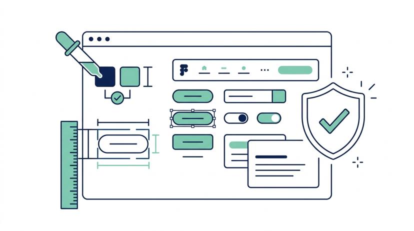
Catch Accessibility Barriers in Figma Before Developers Write Code
Fixing digital accessibility issues after production code is built can cost up to 10x more than addressing them during the design phase. A11Y Pros' Figma Design & UI/UX Accessibility Audits evaluate your Figma design files, component libraries, and design systems to ensure WCAG 2.1 and WCAG 2.2 AA compliance before development begins.
Why Shift-Left Design Audits Matter
Most digital accessibility barriers stem from design decisions made long before engineering starts:
- Inaccessible Color Contrast: Text and interactive UI elements failing WCAG 4.5:1 / 3:1 contrast ratios.
- Missing Focus Indicators: Interactive components lacking high-visibility focus rings for keyboard navigators.
- Unclear Touch Targets: Buttons, icons, and interactive controls smaller than the 24x24px / 44x44px minimum touch boundaries.
- Ambiguous Screen Reader Order: Complex multi-column grid layouts lacking explicit heading hierarchy and DOM reading order annotations.
By partnering with A11Y Pros during the UI/UX design phase, your design team delivers dev-ready, accessible Figma components that streamline development and eliminate costly post-launch remediation.
What Our Figma Accessibility Audit Includes
Our IAAP-certified accessibility consultants review your Figma design files using specialized inspection tools, screen reader emulation, and manual UI/UX analysis:
1. Color Contrast & Visual Design Audit
- Text & Non-Text Contrast: Audit primary, secondary, brand, and state-based color pairings for WCAG 2.1/2.2 AA compliance across light, dark, and high-contrast themes.
- Color-Only Information: Verify that form states (errors, warnings, success badges, active navigation tabs) do not rely solely on color to convey critical information.
- Typography & Zoom Scalability: Inspect font scale ratios, line heights, letter spacing, and line lengths to ensure readability when text is zoomed up to 200%.
2. Component & Interactive State Review
- Focus State Specifications: Ensure every interactive component (buttons, form inputs, dropdowns, modal dialogs, cards) includes high-visibility focus indicator specs with a minimum 3:1 contrast ratio.
- Touch Target & Tap Boundaries: Measure button paddings, icon click zones, and interactive controls against WCAG 2.2 Target Size (Minimum) 24x24px and 44x44px mobile touch guidelines.
- Form Validation & Error Messaging: Review inline error patterns, helper text, required field indicators, and accessible error announcements in Figma wireframes.
3. Screen Reader & Layout Annotations
- Heading Structure & Outline: Map visual
H1throughH6typography to explicit semantic heading levels, ensuring a logical document outline. - Screen Reader Reading Order: Annotate multi-column grid layouts, sticky banners, side drawers, and responsive breakpoints with explicit screen reader reading order.
- Accessible Names & ARIA Specs: Provide explicit ARIA roles, widget states (
aria-expanded,aria-selected,aria-checked), and accessible name guidance directly on Figma specs.
4. Interactive Components & Motion Accessibility
- Modal Dialog & Drawer Specs: Annotate keyboard focus containment loops, initial focus targets, and
ESCkey dismiss behavior for popovers and modal overlays. - Animation & Motion Sensitivity: Audit UI micro-animations, auto-playing carousels, and visual transitions against WCAG Three Flashes thresholds and
prefers-reduced-motionrequirements.
5. Design Team Walkthrough & Actionable Deliverables
- Annotated Figma File: Direct inline design annotations, callouts, and spec overlays placed directly in a dedicated branch of your Figma design system.
- Prioritized Audit Deliverable: Executive summary spreadsheet detailing every design barrier ranked by severity level (Critical, Serious, Moderate).
- Live Q&A Walkthrough Session: Interactive 45-minute video debrief with your UI/UX design and engineering leads to review findings and answer technical questions.
Simple, Transparent Pricing
Figma Design Audit
Catch accessibility barriers in Figma design systems before developers write code.
- Component library color contrast review
- Touch target & focus indicator specs
- Heading hierarchy & DOM order annotations
- Screen reader spec documentation
- Design team Q&A walkthrough session
Get Started with a Figma Design Audit Today
Whether you are launching a brand-new design system or updating an existing UI component library, A11Y Pros will ensure your designs are inclusive and compliant from day one.