Accessible Web Components: Introducing A11Y UI Elements for Framework-Agnostic WCAG Compliance
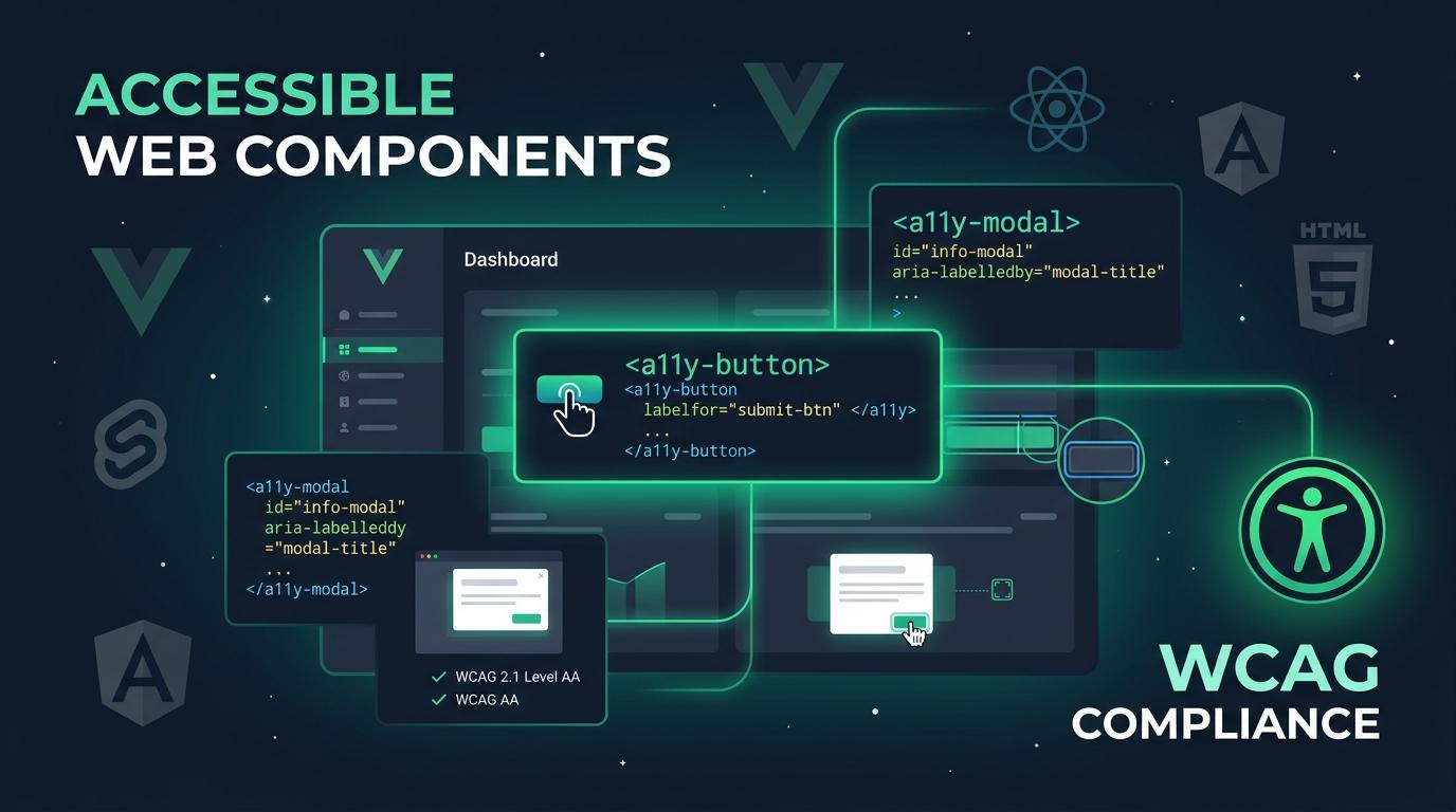
Build WCAG 2.1/2.2 AA & AAA Compliant UIs Across Any Tech Stack with Zero Runtime Dependencies
The Multi-Framework Accessibility Dilemma
In modern web development, engineering organizations rarely stick to a single frontend stack. A single enterprise might build customer dashboards in React, public marketing pages in Astro or WordPress, high-throughput internal tools in Vue 3, and microsites in Svelte.
Yet, when organizations commit to digital accessibility—mandated by the Americans with Disabilities Act (ADA), Section 508, and the European Accessibility Act (EAA)—this multi-framework landscape creates a compounding nightmare:
- Duplicated Engineering Effort: Developers must repeatedly reimplement complex WAI-ARIA patterns (roving tabindex, modal focus traps, live region announcements) across every framework.
- Inconsistent User Experience: Small behavioral discrepancies between custom widgets frustrate screen reader and keyboard-only users who navigate across your product lines.
- Severe Compliance Risk: A subtle flaw in a single framework's dropdown or modal component can expose your business to expensive demand letters and ADA litigation.
Earlier this year, we launched @a11ypros/a11y-ui-components, our dedicated React component library. But accessibility belongs to every developer and every tech stack.
Today, we are thrilled to introduce @a11ypros/a11y-ui-elements—a production-ready, framework-agnostic Web Component library engineered from the ground up for WCAG 2.1 and 2.2 Level AA & AAA compliance.
Why Web Components? And Why Light DOM?
Standard W3C Custom Elements (v1) offer the holy grail for enterprise design systems: build an element once, and use it everywhere—in plain HTML, Vue, Angular, Svelte, Astro, SolidJS, PHP/WordPress, Laravel, Ruby on Rails, Django, and React 19+.
However, many early Web Component libraries suffered from a major flaw when it came to accessibility: Shadow DOM boundaries.
The Shadow DOM Accessibility Trap
When Custom Elements encapsulate their internals within a closed or open Shadow Root:
- Form inputs fail to associate cleanly with outer native
<form>elements without complex Form-Associated Custom Elements (FACE) workarounds. - Standard accessibility associations like
<label for="my-input">,aria-labelledby, andaria-describedbycannot pierce Shadow DOM boundaries, stranding assistive technologies. - Global styling tokens and high-contrast user stylesheets are difficult to cascade consistently.
The Solution: Light DOM Architecture
@a11ypros/a11y-ui-elements takes a pragmatic, accessibility-first approach by utilizing a Light DOM architecture:
- Seamless Native Form Association: Inputs, checkboxes, and textareas integrate directly into standard form submissions without artificial polyfills.
- Unbroken ARIA References: All
aria-labelledby,aria-describedby, andaria-controlsrelationships remain intact in the main DOM tree for screen readers (NVDA, JAWS, VoiceOver, TalkBack). - Zero Runtime Dependencies: The entire library ships with 0 kB of third-party dependencies. No bloat, no security vulnerability alerts, and lightning-fast load times.
Key Features & Accessibility Safeguards
Every element in @a11ypros/a11y-ui-elements is designed by certified Web Accessibility Specialists (WAS / CPACC).
1. Robust Keyboard Navigation & Focus Management
- Interactive widgets (tabs, data tables, menus) implement the standardized WAI-ARIA roving tabindex design pattern.
- Dialogs and modals (
<a11y-modal>) leverage native<dialog>primitives with automatic keyboard focus trapping,Escapekey dismissal, and guaranteed focus restoration to the trigger element upon closing.
2. Built-in Screen Reader Announcements
- Dynamic widgets like
<a11y-button>and<a11y-banner>communicate status updates via polite and assertive ARIA live regions (aria-live="polite",role="status",role="alert"). - Accessible loading states automatically toggle
aria-busy="true"and inform blind or low-vision users when asynchronous tasks complete.
3. Accessible Design Tokens & Theming
- Built on standard CSS custom properties (
--a11y-*), allowing you to tailor spacing, typography, and color schemes while guaranteeing WCAG 4.5:1 text contrast and 3:1 graphical control contrast. - Automatic support for
prefers-reduced-motionto protect users with vestibular disorders andprefers-contrastfor high-visibility environments. - Seamless light and dark mode toggling via simple
data-theme="dark"attributes.
Component Suite Overview
The @a11ypros/a11y-ui-elements library provides a comprehensive set of building blocks for enterprise applications:
| Element | Description | Keyboard & Screen Reader Features |
|---|---|---|
<a11y-button> |
Primary, secondary, ghost, & danger buttons | Accessible loading states, aria-busy, live updates |
<a11y-switch> |
WAI-ARIA compliant toggle switch | Space/Enter activation, role="switch", aria-checked |
<a11y-modal> |
Accessible dialog overlay | Native <dialog>, focus trap, Escape dismiss, focus return |
<a11y-accordion> |
Expandable disclosure panels | Enter/Space activation, aria-expanded, single/multi expand |
<a11y-tabs> |
Accessible tabbed interfaces | Arrow key roving tab navigation, role="tablist", aria-selected |
<a11y-data-table> |
High-performance data table | In-place sorting, row selection, aria-sort, screen reader feedback |
<a11y-tooltip> |
Contextual popup hint | Focus/hover activation, Escape dismiss, role="tooltip", aria-describedby |
<a11y-banner> |
Status notifications & alerts | Alert roles (role="alert", role="status"), dismissible |
<a11y-link> |
Semantic hyperlink | External link warnings, screen-reader-only labels |
<a11y-menu> / <a11y-menubar> |
Dropdown & application menus | Full arrow key navigation, roving tabindex, WAI-ARIA menubar pattern |
| Form Suite | <a11y-input>, <a11y-textarea>, <a11y-select>, <a11y-checkbox>, <a11y-radio>, <a11y-fieldset> |
Native form submission, real-time validation error linking, persistent helper text |
Getting Started in Seconds
1. Installation
Install @a11ypros/a11y-ui-elements using your preferred package manager:
npm install @a11ypros/a11y-ui-elements
Or with Yarn / pnpm:
yarn add @a11ypros/a11y-ui-elements
# or
pnpm add @a11ypros/a11y-ui-elements
2. Include the Styles
Import the component stylesheet in your root JavaScript/TypeScript bundle:
import '@a11ypros/a11y-ui-elements/dist/styles.css';
Or reference it directly from a CDN inside your HTML <head>:
<link rel="stylesheet" href="https://unpkg.com/@a11ypros/a11y-ui-elements/dist/styles.css" />
3. Register Elements
You can register the full element catalog at once, or use tree-shaken subpath imports to minimize bundle size:
// Register all elements
import '@a11ypros/a11y-ui-elements';

// Or cherry-pick only what you need
import '@a11ypros/a11y-ui-elements/button';
import '@a11ypros/a11y-ui-elements/switch';
import '@a11ypros/a11y-ui-elements/modal';
Multi-Framework Implementation Examples
Vanilla HTML / Static Site (CDN)
No build step required. Perfect for WordPress themes, Rails templates, or lightweight landing pages:
<!DOCTYPE html>
<html lang="en">
<head>
  <meta charset="UTF-8">
  <title>Accessible Web Components Demo</title>
  <link rel="stylesheet" href="https://unpkg.com/@a11ypros/a11y-ui-elements/dist/styles.css">
  <script type="module" src="https://unpkg.com/@a11ypros/a11y-ui-elements/dist/bundle.js"></script>
</head>
<body>
  <main>
    <h1>User Preferences</h1>
    <a11y-switch label="Enable High Contrast Mode" checked></a11y-switch>
    <a11y-button variant="primary">Save Changes</a11y-button>
  </main>
</body>
</html>
Vue 3 (Composition API)
Custom Elements bind effortlessly to Vue's reactive properties and custom events:
<script setup>
import { ref } from 'vue';
import '@a11ypros/a11y-ui-elements';

const notificationsEnabled = ref(true);

function handleToggle(event) {
  notificationsEnabled.value = event.detail.checked;
}
</script>

<template>
  <section aria-labelledby="settings-heading">
    <h2 id="settings-heading">Notification Settings</h2>
    <a11y-switch
      :checked="notificationsEnabled"
      label="Receive Security Alerts"
      @change="handleToggle"
    />
    <a11y-button variant="primary">Update Profile</a11y-button>
  </section>
</template>
Svelte
In Svelte, Custom Elements render with zero friction:
<script>
  import '@a11ypros/a11y-ui-elements';
  let isModalOpen = false;
</script>

<a11y-button variant="secondary" on:click={() => isModalOpen = true}>
  View Legal Disclaimer
</a11y-button>

<a11y-modal
  title="Accessibility Statement"
  open={isModalOpen}
  on:close={() => isModalOpen = false}
>
  <p>
    This organization is dedicated to providing digital services accessible to all users under WCAG 2.2 AA.
  </p>
</a11y-modal>
React 19+
With React 19’s first-class support for Custom Elements, properties and custom events work straight out of JSX:
import '@a11ypros/a11y-ui-elements';

export function NavigationBar() {
  return (
    <header className="site-header">
      <a11y-link href="#main-content" className="skip-link">
        Skip to main content
      </a11y-link>
      <nav aria-label="Main Navigation">
        <a11y-button variant="ghost">Features</a11y-button>
        <a11y-button variant="primary">Get Started</a11y-button>
      </nav>
    </header>
  );
}
(Note: If your team is building exclusively in React and prefers idiomatic React hooks, compound components, and native TypeScript JSX elements, explore our companion package @a11ypros/a11y-ui-components.)
Explore the Interactive Documentation & Playground
Want to test keyboard interaction, review ARIA markup, and inspect styling tokens in real-time?
- 🌐 Official Documentation Portal: ui.a11ypros.com
- 🎨 Storybook Component Playground: ui.a11ypros.com/storybook-static/
- 📦 NPM Registry: @a11ypros/a11y-ui-elements
- 💻 Open Source Repository: GitHub (A11YPros/a11y-ui)
How A11y Pros Can Help Your Organization
Implementing accessible components is a crucial step toward digital equity, but achieving total ADA and Section 508 compliance requires a holistic strategy.
At A11y Pros, our certified accessibility engineers (WAS & CPACC) partner with engineering teams, SaaS founders, and public agencies to provide:
- 100% Manual Human WCAG 2.1 & 2.2 AA Audits using real assistive technologies (NVDA, JAWS, VoiceOver).
- Official VPAT® (Voluntary Product Accessibility Template) / ACR Documentation required for enterprise procurement and RFP reviews.
- Design System Audits & Custom Component Remediation to guarantee your custom UI remains legally defensible and delightfully inclusive.
Achieve Digital Accessibility Compliance
Explore our manual WCAG 2.1/2.2 AA auditing, website remediation, PDF compliance, and VPAT® documentation services.